‘Heavenly Honey’ is an artisanal honey brand rooted in a passion for sustainable beekeeping. With rapid growth and aspirations for greater market presence, the brand sought a comprehensive strategy to establish a strong identity, elevate its market position, and expand its reach.
I led the project from initial concept to final execution, encompassing branding, digital presence, and visual identity development. My responsibilities included:
- User Research & Analysis: Conducted in-depth interviews with Kenneth Evensen and analyzed competitors to identify unique positioning opportunities.
- Brand Strategy Development: Crafted a holistic brand strategy, defining core values, target audiences, and market positioning to differentiate ‘Heavenly Honey’ in a competitive landscape.
- Visual Identity & Design: Developed a cohesive visual identity, including logo design, color palettes, typography, and illustrative elements that reflect the brand’s artisanal and sustainable ethos.
- Digital Presence: Designed and developed the brand’s website using WordPress, ensuring a seamless user experience across devices and integrating SEO and speed optimization for enhanced visibility.
- Content Creation: Authored all website content, focusing on clear, honest, and engaging communication that aligns with the brand’s values and narrative.
Step 1: Problem and goal exploration
I begin my design process by trying to understand my clients, their values, their challenges, and their goals. So I visited the beekeeping farm, interviewed the owner, analysed the competitors on store shelves and online, and began talking to his costumers. These insights are confidential but resulted in quite a few thousand words of notes, before I even touch a design programme.
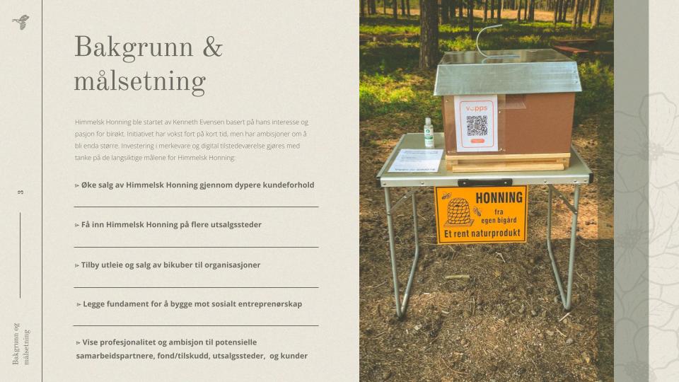
Goals of ‘Heavenly Honey’:
Kenneth wants to not just anonymously deliver honey to a larger supplier but to build his own brand where he can sell more expensive artisanal honey and get it into more stores. He also wants to establish himself as a reputable beekeeper. He sought me out so he could invest in branding and digital presence is done with the long-term goals of ‘Heavenly Honey’ in mind:
- Increase sales of ‘Heavenly Honey’
- Get ‘Heavenly Honey’ into more retail locations
- Offer rental or sale of beehives to organizations
- Lay the foundation for social entrepreneurship
The goals identified are found in the brand handbook that I developed in real-time as I worked on the project:
Who are the competitiors?
The honey market he is in can be broadly categorized into two segments: generic honey providers and artisanal honey brands.
- Generic Providers: These are the mainstream honey brands available in major retail stores, known for their affordability and uniformity. They dominate the market with consistent, mass-produced products but lack distinctiveness and a personal touch.
- Artisanal Providers: This segment consists of smaller, craft-focused brands emphasizing handcrafted products and unique stories. Within the latter group, there is significant variation in brand positioning and presentation. The two poles of the spectrum appear to be:
- Minimalist & Industrial: Some artisanal brands adopt a minimalist and industrial aesthetic, aiming for a modern and clean look. However, this can sometimes appear impersonal and overly commercial.
- Homemade & Rustic: Other brands lean heavily into a rustic, homemade feel, often using handwritten labels and unpolished packaging. While this conveys authenticity, it can sometimes raise concerns about quality control among consumers.
This leaves a market opportunity between the two poles. A polished yet artisanal presentation can differentiate ‘Heavenly Honey,’ offering the charm and authenticity of handcrafted products with a refined, professional aesthetic. This approach aligns with Kenneth’s vision and the unique qualities of his offerings, positioning ‘Heavenly Honey’ as a premium, trustworthy choice in the artisanal honey market.
Target customer analysis
The customer for this product is not defined by a specific demographic but rather by a general interest and demand—a needs-based segmentation. ‘Heavenly Honey’ caters to two primary target groups:
- Individuals: ‘Heavenly Honey’ can be purchased directly from Kenneth Evensen or through selected retailers. Marketing efforts must therefore appeal to both end consumers and retailers who share the same target audience. Key focus areas include communicating values, product benefits, and detailed product information to attract this group.
- Businesses: ‘Heavenly Honey’ aims to offer beehives to organizations through leasing agreements or direct sales. This secondary target group includes businesses, organizations, and associations where professionalism, credibility, and a strong presence are crucial.
Designing the brand strategy to appeal to the end customer is essential since their preferences ultimately influence business customers’ decisions. ‘Heavenly Honey’s product is for consumers who seek a conscious relationship with their purchases and are willing to invest in quality. This interest is growing across various social groups, making ‘Heavenly Honey’ the perfect response to this need with its handcrafted, ethical, and rustic honey.
Step 2: Brand Strategy
Why strategy?
Designing a brand involves more than just creating a logo; it requires a comprehensive strategy. Marketing is fundamentally about building relationships with your target audience, and a brand strategy is an integral part of this relationship-building. People form relationships with brands just as they do with people, developing mental images of who they are, what they stand for, and how they relate to them. A brand encompasses your identity and the mental image people have of it, including logos, symbols, colors, typography, and artistic expression, all of which together form your visual identity.
The Core Values for ‘Heavenly Honey’:
Identifying core values is crucial for differentiating ‘Heavenly Honey’ from competitors and resonating with customers. A company’s values and benefits are the brand’s “motivating heartbeat,” communicated consistently over time. They form the stable core that supports the visual profile and are the focal point for ongoing marketing efforts.
Through initial research, the following core values were highlighted:
- Local: Emphasizing local production and community engagement.
- Natural and Down-to-Earth: Highlighting the authenticity and simplicity of the products.
- Sustainable: Commitment to environmentally friendly practices.
- Personal: Fostering a close, personal connection with customers.
- Exclusive, Not Mass-Produced: Offering unique, high-quality products.
- Quality: Ensuring superior product standards.
The image below shows a summary of the analysis shown to the client in the brand handbook:
Positioning strategy
The competitive analysis revealed the market opportunity that ‘Heavenly Honey’ can take advantage of, within a growing niche of products that are local, ecologically aware, socially engaged, and crafted with care.
This strategy positions ‘Heavenly Honey’ as a counterpoint to mass-produced, faceless imports, resonating with consumers who seek higher value through ethical and local production. This strategy balances the charm of handcrafted products with a professional aesthetic, aligning with Kenneth’s vision and the brand’s unique offerings. By positioning the brand as a premium, trustworthy choice in the artisanal honey market, ‘Heavenly Honey’ appeals to consumers who value quality and authenticity.
Challenges to consider for this positioning approach
Adopting the «Innocence» archetype means the brand must consistently uphold its ethical commitments. Transparency and honesty are vital, especially as the brand grows. Rapid growth can attract media scrutiny, making it crucial for ‘Heavenly Honey’ to maintain authenticity and integrity.
Archetypes to support positioning through heuristics
Archetypes serve as a useful framework for developing a brand’s voice, tone, and visual profile, supporting the broader positioning strategy towards a target audience. They help craft associations that allow people to quickly categorize and form mental images of the brand, leveraging psychological heuristics—mental shortcuts used to make quick judgments. No brand starts from scratch. People have pre-existing categories for both people and products, helping them make quick decisions without thoroughly evaluating every detail. By identifying and leveraging an appropriate archetype, we can position the brand effectively within these mental categories, aligning with the organization’s products, goals, and values.
For ‘Heavenly Honey,’ the chosen archetype is «Innocence,» emphasizing purity, simplicity, and trustworthiness. This archetype helps differentiate the brand from mass-produced, impersonal, and unsustainable products, aligning with Kenneth’s vision and the brand’s core values. This helps give a language to talk about the positioning, involving the client in beginning to understand why certain choices are made later on—a hook to put the brand on.
Language and Tone:
I authored all the content for ‘Heavenly Honey’s website, focusing on a thorough language analysis to ensure consistency with the brand’s values. The language used is direct and clear, informal without appearing commercial, and includes frequent use of “I” and “we.” It emphasizes honesty, openness, engagement, and tradition, ensuring consistency with the brand’s values.
Challenges to consider:
When crafting brands, I also pay attention to challenges associated with the specific approach pursued. In this case, positioning the brand around its ethical promises is potent but also runs a risk if the company does not fulfill its promises of transparency and honesty. Brands with this positioning must consistently defend their ethical commitments. Rapidly growing brands can become media targets if they fail to live up to their promises, making it critical for ‘Heavenly Honey’ to maintain authenticity and integrity.
Step 3: Visual Identity Concept Development
With a solid strategy in place for positioning, target groups, and brand personality, the next step is to develop the visual identity.
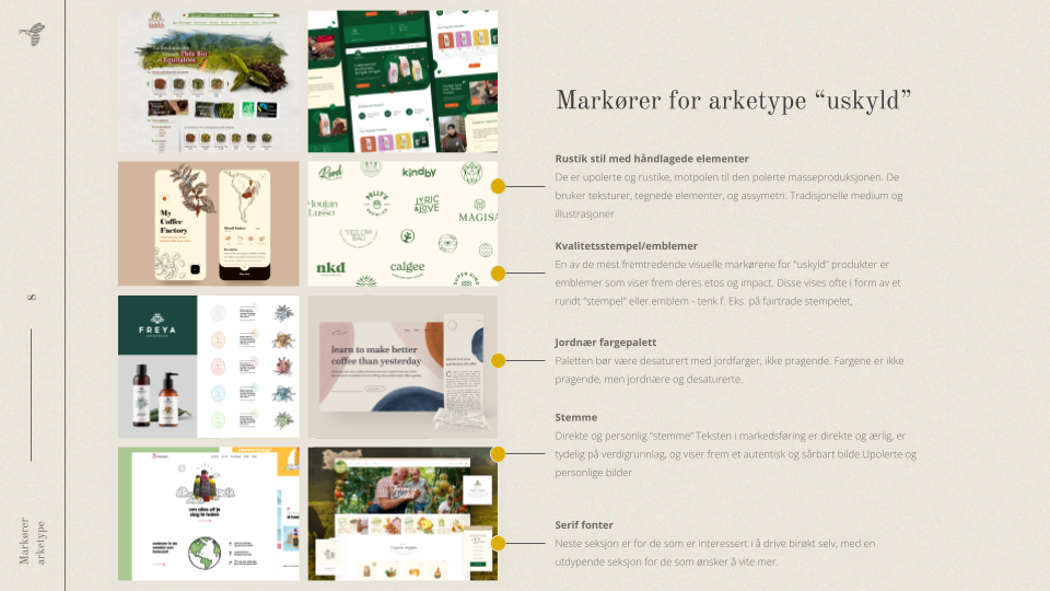
Analysis of visual markers aiding the positioning strategy
Using archetypes provides a language to describe similar brand personalities, which is incredibly useful during the early stages of visual identity development. By identifying other brands with similar positioning strategies in different sectors, I can pinpoint common themes in visual identity choices. Engaging with target customers to discuss which visual traits they associate with these brand personalities helps refine the visual strategy.
Key Visual Traits Identified:
- Unpolished Impression: Brands with a rustic, handcrafted look stand out against polished, mass-produced products. This involves using textures, hand-drawn elements, and asymmetry, often achieved through traditional media and illustrations.
- Use of Emblems: Emblems and stamps that highlight ethical commitments such as “organic” or “no pesticides” are effective. These icons quickly convey the brand’s values, similar to those used by fairtrade and organic food brands.
- Earthy Color Palettes: A desaturated, earthy color palette communicates a natural and down-to-earth aesthetic, avoiding bright, flashy colors.
- Serif Fonts: Serif fonts, as opposed to sans-serif, appear more traditional and artistic, aligning with a handcrafted and authentic brand image.
Moodboard Development:
After defining the overall strategy and identifying key design markers, I created a moodboard to visualize the brand’s identity. This involved gathering inspiration from companies in other sectors with similar positioning and experimenting with different visual approaches to meet the strategic objectives.
Logo Drafts:
With the overall visual ‘vibe’ established, I began the work of drafting a logo that reflects the personality of ‘Heavenly Honey’. The images below show the sketches I presented to Kenneth for discussion, leading to the final design choice.
Typically, I draft logos that can be scaled to very small sizes for versatility. However, aiming for a vintage and handcrafted aesthetic, we decided together that an illustration-style logo would best support this goal. While I assured ‘Heavenly Honey’ that I could create a smaller version for specific needs, we agreed that this approach was the most fitting for the project. This decision enhanced the brand’s unique identity and aligned with its artisanal and rustic character.

Step 4: The Result
Logo
The ‘Heavenly Honey’ logo prominently features an «H» creatively drawn by a bee, symbolizing the brand’s core product and artisanal nature. The logo combines hand-drawn elements with vector precision to maintain its handcrafted charm and professional quality.

A smaller, scalable version was also created to ensure versatility across various applications.
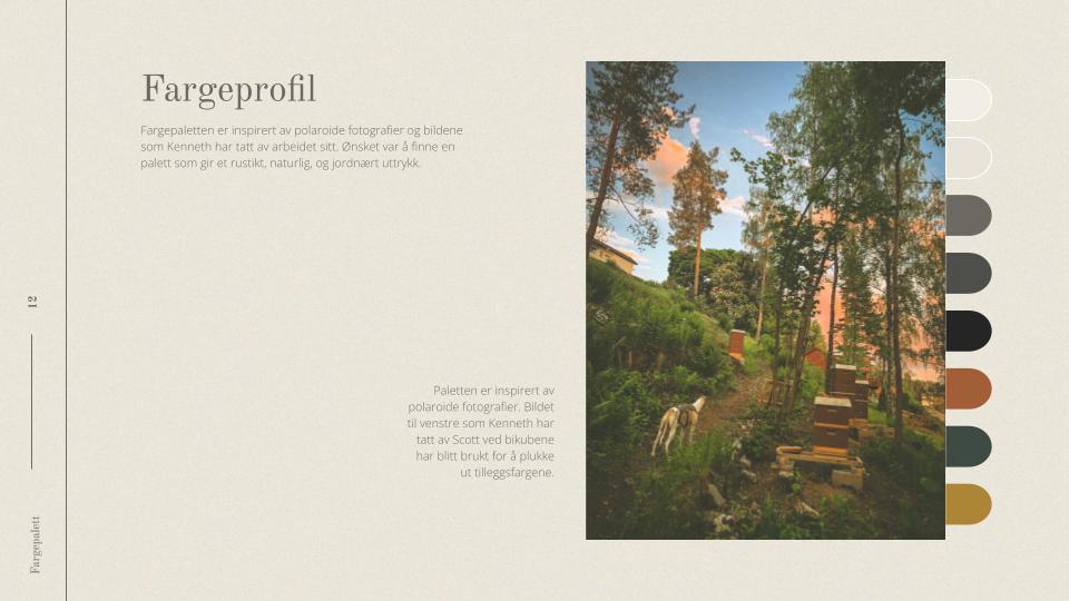
Palette:
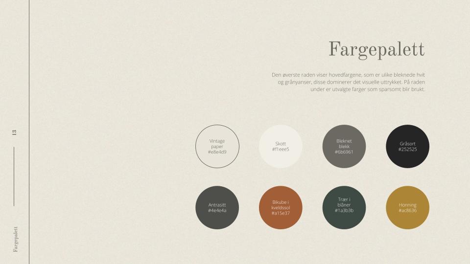
Inspired by Polaroid photographs and Kenneth’s own imagery, the color palette embodies a rustic, natural, and earthy aesthetic. The colors were selected based on a photograph Kenneth took of Scott by the beehives, shown here. The tones were carefully selected to evoke a sense of authenticity and warmth, aligning with the brand’s local and sustainable values.
Images:
Kenneth’s personal archive provided a rich source of authentic imagery, supplemented by licensed photos from Envato Elements. Each image was meticulously edited to achieve a vintage Polaroid look, enhancing the brand’s nostalgic and artisanal feel. Techniques such as adding grain, dehazing, desaturation, and precise color adjustments were employed to ensure consistency and visual harmony.
They have also been cropped to fit together seamlessly like a puzzle.
Typography:
The typographic choices further reinforce the brand’s identity. Old Standard TT was selected for headers, lending a traditional and refined touch, while Open Sans was chosen for body text, ensuring readability and a modern contrast.
Emblems/Icons:
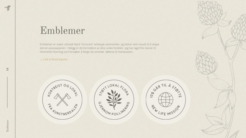
I created four icons for ‘Heavenly Honey’ to capture the brand’s central promises:
- Local and close to home
- Support local flora through pollination
- 10% supports New Life Mission
These icons serve as quick visual cues to communicate the brand’s ethical commitments and are utilized across digital and physical packaging.
Illustrations:
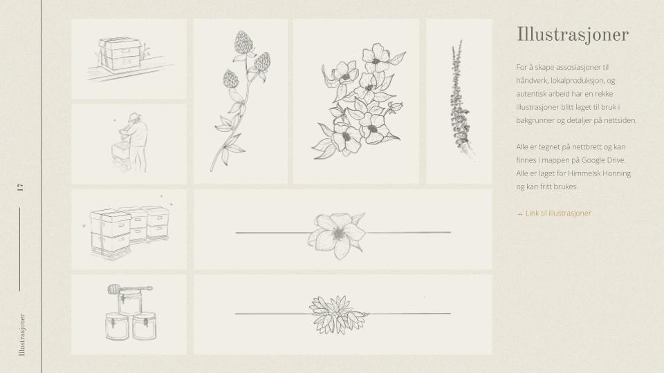
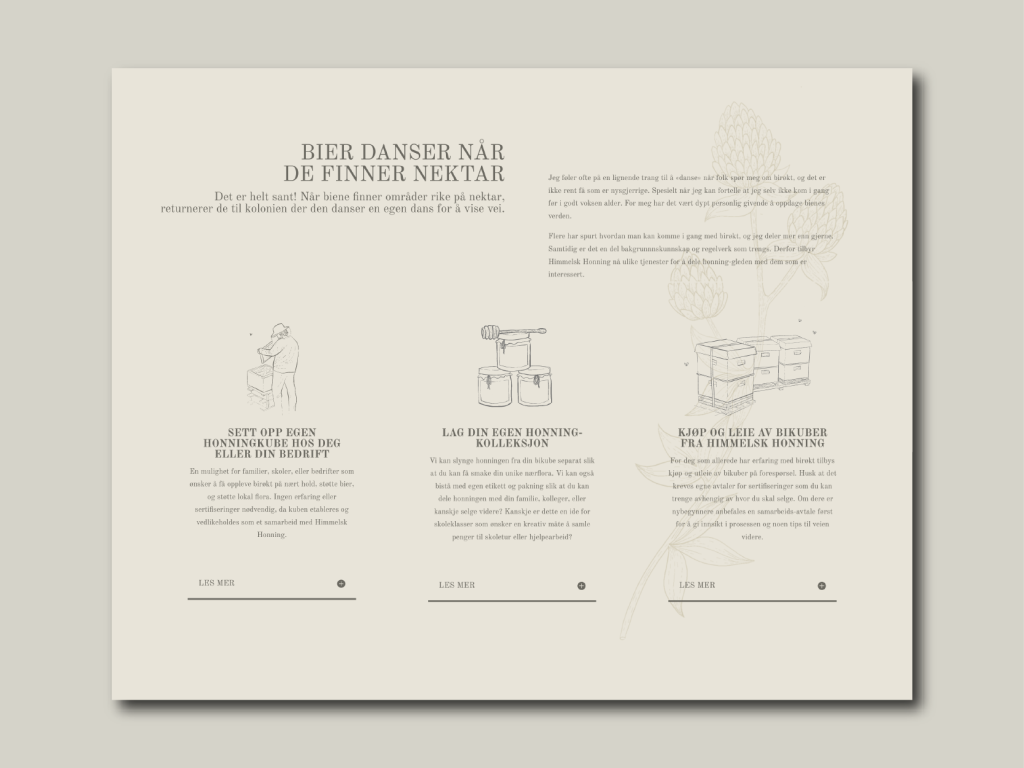
To emphasize craftsmanship and local production, custom illustrations were created. These visuals enhance the website’s background and detailed sections, providing a unique and artistic touch that differentiates the brand. All illustrations were hand-drawn on a tablet and are available for use in various brand applications.
Website:
The ‘Heavenly Honey’ website was designed and developed using WordPress, leveraging its extensive capabilities and flexibility. Utilizing the Divi theme, which offers lifetime licensing, I ensured that Kenneth has access to a robust Visual Builder for easy future edits. The site features integrated SEO and speed optimization to enhance visibility and performance.
Responsive Design: The website is fully responsive, optimized for mobile and tablet users, who represent about 50% of web traffic. This ensures a seamless user experience, whether customers are browsing at a stand, through flyers, or via direct referrals.
Blog: A dedicated blog section allows Kenneth to share updates, recipes, and beekeeper facts, enhancing engagement and building a community around ‘Heavenly Honey.’ The blog is designed for easy navigation and integration with social media to extend its reach.
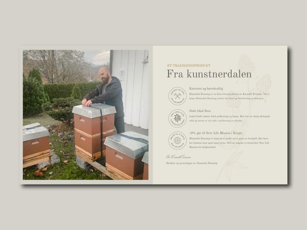
The emblems and the faint illustration used as part of the background added artisan flair to the website:
The illustrations adds flair to the website section featuring the options for getting involved in beekeeping:
Conclusion
From the initial research and strategy development to the creation of a distinctive visual identity and a fully functional website, every step has been aimed at reflecting the core values of the brand: local, natural, sustainable, personal, exclusive, and high-quality. The handcrafted logo, earthy color palette, and carefully curated images all contribute to a rustic and authentic aesthetic that differentiates ‘Heavenly Honey’ from mass-produced competitors.
The client was thrilled with the result and the feedback was overwhelmingly positive. Unfortunately, for entirely different reasons, the beekeeper had to end his business a short time after the rebrand, so we were unable to see where it could have ended up. It’s been one of the most fun projects I’ve worked on, and I’ve thoroughly enjoyed being able to bring in illustrations to such a large degree.


