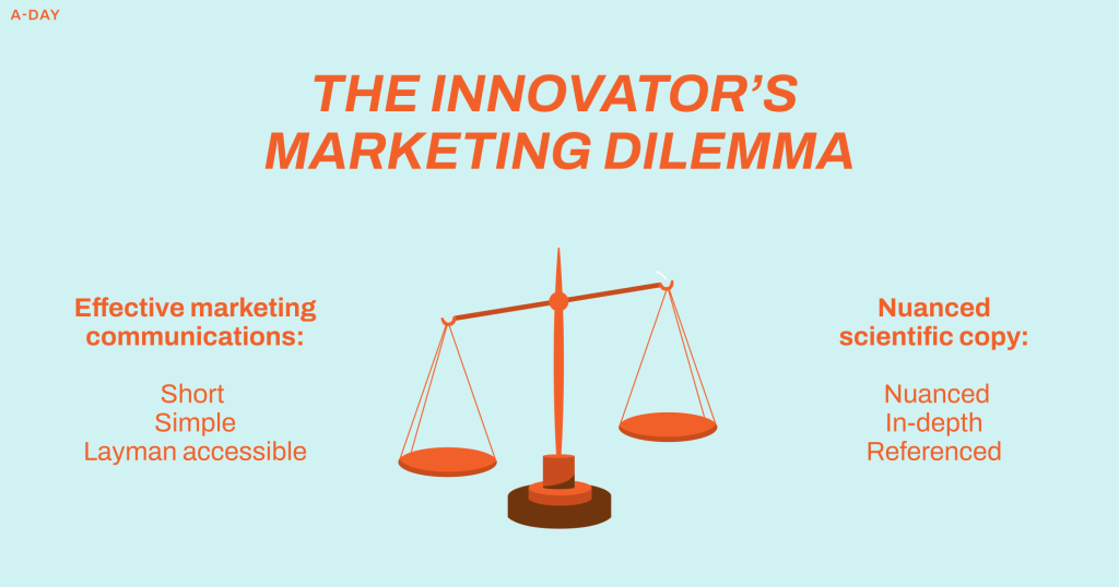
There is a trade-off between effective and accurate communications
How does one effectively communicate a complex idea without losing nuance and rigour? This tradeoff has easily been the biggest marketing in my role as Chief Marketing Officer at Vitaegum.
Innovative companies have a higher burden of communication: because innovation is intrinsically unfamiliar.
We have to hook viewers in and guide them through an educative process without losing them along the way. At the same time, we want to maintain the rigour, nuance, and accuracy that are at the core of our ethos.

Good design solutions can help solve this tension
As the sole non-scientist in Vitaegum, I was tasked with creating an engaging website without diluting the project’s scientific grounding. Good copywriting (text) can solve much of this problem – but I have found that design plays a major role in solving this communication challenge.
This article outlines some of the techniques featured in our website teaser, and how they helped us solve the innovation communication dilemma.
Some of them are well-known methods for keeping user attention, but most revolve around ways of hiding dense information while still having it accessible.
1: Use tabs, sliders and accordions to make the user take charge of additional learning
The worst enemy of user engagement are dense walls of text.
One of the first rules of effective copywriting is to write less, but this creates the aforementioned dilemma where richness and depth of content takes a toll.
A major benefit of digital interfaces is that you do not need to make static pages where all information is immediately visible to the user.
There are various interactive layout solutions that allows you to limit the amount of words that are visible on the screen, without removing them entirely.
Tabs work like they do in a browser, except they only change content within a box on the website. Accordions allow users to open up a box with content by clicking, and collapsing it with another. Horizontal scrolls and slideshows allows users to click on arrows (or swipe on their phones) to read more.
All of these solutions ensures that the overarching storyline is told clearly with few words – but users can also easily read more when they are interested with just a click.

2: Using animations and visualisations
Another major benefit of online communications is the ability to add movement and multimedia for a more immersive experience.
On the web you can use animations that interacts with the user scrolling or moving the mouse, and the possibilities are so vast I do not intend to go through them here.
On the A-Day website I have used animations extensively, but one of the best examples in my opinion is on the Impact page. This page was particularly challenging because it contains a lot of statistics, dense information, and numbers. After first organising the page so that much of the text were placed within containers (see point 1), the problem remaining was the long lists of numbers. But even numbers can be interesting when visualised. By animating them in various ways, a text- and number-heavy page becomes easier to read and digest.


3: Illustrations and hotspots
I am a highly visual communicator and always find myself creating illustrations and diagrams when trying to make information accessible and engaging.
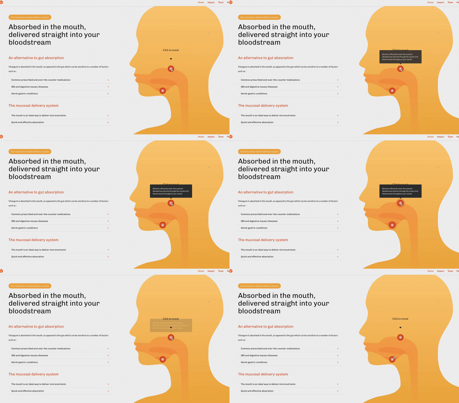
One of the major illustrations I wanted to make for the A-Day was one that drew attention to the fact that it is absorbed in the mouth. I combined this illustration with hotspots where users hover over a tooltip in order to reveal local pop-ups with more information.
Hotspots offer a unique solution to the challenge of balancing depth of content with readability. Just like the layout discussed above, hotspots allow the main content can remain concise and focused, hotspots provide a platform for additional, more detailed information to be available on demand. It also combines well with illustrations which has long been recognised for their role in effective communication.
In conclusion
The three techniques I have mentioned are only some of the many ways that design solutions can help improve communications in the digital space. They are examples of why I personally struggle to take any production/copywriting jobs where I am not allowed to also take advantage of the other opportunities the digital medium affords us.
*This blog post is now a few years old. Since then, I have designed a new and improved website that takes these techniques even further. Please refer to later blog posts about «The A-Day» which the start-up is currently known as.


